22 February 2010
Am I overdosed?
hmmm, im starting to think whether im overdosed on my medication..hmm... let's see, my current count of med is 7 different type, one of which is an anti-biotic, the third set im eating as of now... am i overdosed? shrugs, dizzy, i think it's the med's influence, i read one of them induces drowsiness...
Help GetHelp! :: why i think it might not have made it big
I think it's rather cute that the case study we're supposed to do is Get Help! makes it rhyme with the help Get Help! haha
Overall, I think the whole project idea is very good though I do suppose they would have to put in more time into designing their applications and make sure that it is easy to use it to accomplish their goals : Get help outside of those you know, higher chances. Though i do have to mention that while the idea is good, it has a huge competitor, search engines like Google. Most people, when they want help they'd just search the internet and have instant answers at their finger tips. They might to want to post at Get Help! Perhaps, also one of the biggest reason why they might not have made it big, there're already established forums out there to solve different needs, help sites everywhere, just a keyword and enter away. As this is not spontaneous help and people have to check each day if someone replied which i might add, might be days or weeks before you even get one comment, it is not as attractive as search engines.
That aside, on a first glance, the whole application looks pleasing enough, the graphics are nice, it was aesthetically pleasing to the eyes. However, this problem and question keeps stumbling me throughout my journey to help create Gentoo. Is aesthetically nice graphics always enough to sustain or make a successful application. More often then not, the answer smacked me back straight in the face (quite hard I must add), no. I learnt it the hard way the first time round. Yes, I agree that good nice user interface is a deciding factor and is needed but definitely not a must or a will lead to success factor. Just take a look at facebook, many of the most popular applications out there don't really have the aesthetics. Fancy stuff don't always work if it's not user friendly with the stickiness factor, especially on facebook. With so many appliciations out there, fancy graphics alone will not help keep the users, cause i'm sure when they use an application, they stay because the application is fun and useful to them, not just because it's fancy.
That being said, Get Help! graphics is really nice and pleasing on the whole, however, I do believe that there can be improvements done to make it simpler, or rather, more focus as well as more user friendly.
For one, I feel that the diagonal tabs was rather placed in a very awkward manner. Firstly, i have to tilt my head to look at what it is about. It makes me feel, out of balance with the tilting of the tabs. The stats 3D model idea was nice but admittedly doesn't quite fit in nicely. for one, the like the tab, it's slanted and is a top-down view that i have to consciously take closer look to make out what it is about. Furthermore, the different slant between the icon in the tab and the actual one when in the stats place slants different direction and while i don't think it does make a great impact on the first glance, it does subtly put the user off balance, especially when the other icons are not as solidly 3D. It some how put user off balance in a subtle way.
That aside, I think the words for the tabs could have been bigger or at least more obvious, since when i win+left the browser, the words are meshed together and rather hard to read. I do recommend for the profile icon to be simpler in design since it's rather complicated and not as focus.
As for the shield, i do believe that the outline could be bold (standardise with the rest of the tab icons and the shape more defined) with the middle picture a obvious design, of perhaps a medal so that it will stand out? The actual badge is rather cute as well though I'd suggest different design for perhaps, different categories of medal, perhaps, colour code it like a real medal, bronze, silver, gold e.t.c. it might entice the user to want to get a nice medal~ nice idea to have nice nicknames for that goes hand in hand with the medal as well. Another suggestion could be that the user can "pin" their medal on their facebook profile with perhaps and optional personal description at what their area of specialties are so that 1) acknowledge user's contribution, makes them proud 2) spread the word 3) allow the user to want to create an image that they can provide very good quality help. You might want to create ratings for how well each help goes as well.
A little side note on the invite icon, the guy looks rather fierce and if i didn't see the invite, i'd have thought that it was for perhaps complain or something like that. A more friendly icon would be preferred in my case, or a simple icon.
There're also a little thing that some people have noticed, the inconsistency of interface. For one, if the tags are there as navigation tags, then i suggest all major navigation should be there, there're missing elements like the projects page. When all the tags are in monochrome, it makes me wonder, where's the tag that's supposed to be in colour? that is one thing that i think should be noted. Moreover, the tags should be consistent, either overlap or be overlapped at all times, or if you want, on the active one is overlapped. The disparity can be rather unpleasing.
Regarding the user interface, i do think the Project Page was rather badly designed since i have no idea what the whole page is about. (I believe a good application user interface should allow the user to use the application without even looking for instructions, i myself am working hard towards it for penguin >w<) The layout is rather cluttered and as mentioned above, i have no idea what to do about them. I would suggest a clean and need page with perhaps a divider between one's projects or rather their own help needed (btw, why is it called project, it's rather odd considering that this is about getting help) as well the general list of all the help out there. One question that i have in mind, how do i know if others need help, from what i can see, you'd have wait for people to ask you. I believe that an additional structure feature that could be added is perhaps common area for all the projects to be placed at. One thing, it makes getting help easier, secondly you can also take a look at topics that interest you, something like that of a forum. The Project page, in my opinion, should be clean cut with just 2 area, one dedicated to your own need and other to those that you're helping. That said, new interface would have to be created instead for contacts (that upon clicking the person will show the links of all the help he's provided or required) as well as a general help area.
Though I think the refer a friend! Help Her! Wish her Luck! thingy is a rather nice idea, it does create incentives to create the necessary network. An opinion of mine would be that helpers dun need to add the application, just be directed to a page where they can post comments and such. This will make things easier and people more willing to help out without all the trouble of adding the application and what not. When they need help, they just add the application, this might be a plausible approach in my opinion.
As for the overview and the statics page, I would suggest that it could be merged together so that it's more focused in one area and the layout should be simple to catch (perhaps the top few and if the user want, could expand it) so that it is easy on the eyes and to use too.
Now that we are on usability, I do believe that they can improve on it. For one the need help page is really cluttered and confusing. For one, if i want a help, I'm not sure if I should type it at the top column alone or need to fill in everything. It is rather tedious to post a help and might not be that user friendly. For one, I do think that the default image really needs to be changed because 1) i have no idea the link and 2) it's rather hard to decipher what it is since the star outline is not consistent and I have no idea what is the background image, is it a gun barrel? Perhaps a catching understandable icon could be used. A suggestion would be to create genres for the various different type of queries so that 1) it is easier to organise and 2) easy for other users to tell and pick the type of help they can provide instead of reading through everything. With the different categories, it's more focused and easier to get help. If i'm a programmer seeing if i can help, I won't really go read through all the help request to see which one i can solve will i? Though the idea of putting personal picture up there is a nice freedom given to user, i don't see how it'd help if im scanning through request using the pictures?
That aside, i do believe that the interface really should reduce on some optional stuff. For example, they could have adopted the library search structure. With just the main title there (at least the general genre as the caption) with the description and the specific type of help that they might require. The should placed in a expandable button or extra details. That said, i wonder what's the deadline and estimated time dong there together? I suppose the deadline (i personally would have prefer a nicer phrasing since deadline is like chasing someone for answer/assignment like that) would be when the person needs the help by (most won't bother, are they gonna take down the project once it's past the deadline?) I have no idea what estimated time does and why location matters (this is to get help over the internet through network isn't it) but I do believe that users should be able to create their own tags, if I'm mistaken then sorry. In this case, with all the options and what not listed out there, while it gives users wider choice, it also gives the impression that user cannot just post "express" query that's straight to the point without those fancy stuff.
Regarding the "who do you want to ask" I think it's a great idea to allow the users to choose who do they want to ask but I do believe that one of the choices would have to be put it up for all to see and help. Limiting the query to just friends is a nice way to get more people to join but i do believe that it can be rather restrictive in the sense where other non-friends can come see and help as well. Though that is accomplished by reference ( to friends of friends) it is not as efficient and user-friendly to ask everyone for help. One of the main purpose is to use facebook's network to get to know other people outside of your circle that might have just the right set of skills to help you. The max scope being posting to all your friends perhaps is a little restrictive in the sense. I am curious that if i click those contradicting choices, what will happen? How to the sms work btw, quite curious, pluck handphone numbers outta friend's profile and spam? interesting concept here but if it's just sms, I could have sent it to my friends myself using my phone which is more accessible unless you can provide me with the contacts i don't have?
Though the fact that they provide different modes of communication, i am curious as to how it will work. How do i reply to you if im on twitter and see that you need help or perhaps received an sms from you? convenient contact by my own means, perhaps msn, (what about strangers? how to contact them back) or open the browser, go to fb, then to the app then look at your request? what if i'm not on the list on the people that got your request through fb, what then, how am i to help? That is perhaps, 1 major loophole they've missed. In terms of freedom, i think they could've done better by allowing people the choice to pick and choose (something like the normal fb interface where you can check off people or things like that) and also allow them the privilege to create their own personal list and choose to allow which group of people to be sent the request for help in which mode. For example, if i have 2 groups of friends, first one to their profile page, perhaps the second to contact then through twitter, the user are restricted in this sense.
it is a very interesting and workable concept though i do think they need to put more thought into it's structural design and what not. A consistent platform for queries to be answered or made would be nice. I personally feel, these should come under the extra options portion, perhaps on another button for extra form of help (the call for help should linked to the general place everyone goes like in forum like that as well as to post help onto the walls of friends, though perhaps im missing something but I don't think they have (sizzling fires don't count). Talking about sizzling fires, i do believe that flame makers should change a name since when first read it, i interpreted it as those flame wars out like like those at jon's blog...
that aside, while these may be problems of the application have faced, I do not think they are as major as being faced with harsh competitions from search engines. Until they have found a way to get around or get better help then a few keywords in search engines like Google can do, they will face a rather hard time to make it big. just my 2 cent, or rather a lot of cents input >.<
21 February 2010
Sweat and cough through New Year :: Pitching~
omg, this year's cny's celebration was rather unique, busy preparations, visiting relatives, studying and what not. Surprisingly, not, i can't seem to stop coughing and flu throughout the new year till now, really suck, i sleep like a pig throughout the days.... omg.. haha, but overall it was a nice experience, to be able to just sleep, im so gonna miss it once tomorrow start. sleep, what a wonderful word..
Just read prof's mail and realised, omg, i did forget to post regarding the pitching session!! shock! i was like, totally outta it, haha, i tend to off my phone and not check stuff during holidays >.< the sleep is just too tempting..mwahhaha, but that being said, here's my blog for the pitching session. Well, it's rather new that i'm going to post and reflect on it after so long and i guess it's a new fresh perspective since I really remember the really impactful points I've learn.
One, there's no such thing is no idea. There's so many wild ideas out there that i can't help but to think that some people are really being boxed in to think that there's nothing else to do out there. There's so many new stuff going on out there and new opportunities. It left me rather inspired. It's just a feeling like, there're so many ideas and opportunities out there to grab, so many people have tried and they've made it. Why not us, why not me! That's a really important feeling and point that I've kept with me, even after so long.
It was rather nice to listen to all the ideas and opportunities out there and 6wave seems to be able to really help us take off once we've managed to complete and enhance our game. It makes me shiver with anticipation about what my group can achieve. Though sometimes it seems a bit far-fetched but it also seem so very possible within our grasp that we can succeed and come up with something that will make a breakthrough.. it's just exhilarating!! It makes me all the more motivated to want to make this happen. After the break is google wave and yet more sprints to be made. Though frankly speaking, I'm feel like I'm quite dying now, like there's so much to do in so little time, like i keep running around trying to get things done not even looking where im going. However, at the end of it, i'd go, whooo, i actually did it! let's hope it's the same for this as well. I'm trying my hardest now :)
02 February 2010
:: Presentation :: Pillow Fight ::
Awesome manz, this whole facebook seminar, I actually enjoyed it. Some of the presentation styles are rather unique like Joshua's video and most of them presents some really interesting points admist laughter. Rumour has it that Henry wants to bring someone to bed tonight is so going to be stuck in my head for quite a while. I rather like the pace of the whole seminar presentation, 7 mins really does have it credits, it makes presentation more or less concise and the general flow is rather nice. That aside, it's my time to start to evaluation on pillow fight.
Review
Pillow Fight - just when was the last time I actually have a pillow fight, perhaps when i was around 8 with my sister? I still hold those fold memories close and loved how we use to just whack each other with pillows and my favourite: bolster. The trill was there and it just feels nice to let go and literally whack! That was years ago, actually I can say decade ago. It really does bring back fond memories. Nowadays, as I observe that while I still find enjoyment and fun in other activities, I miss the child-like trill and fun in letting everything go and just do something silly just for the fun of it. It’s been a long time. That was what I thought of when I registered the words pillow fight. It was a representation of letting oneself go and have fun. It represents childhood and something, just pure of us.I believe that that's what the app's trying to achieve and bring across so that people can still put aside time for these small pleasures (though i do admit the clicking of the buttons can be a rather waste of time). I went to look at some of the post and it warms my heart to see stuff like this:

This pillow fight thing really does have its appeal. One of the points I still remember from the seminar more than 24 hours ago is that it is free, easy to use(even grandmas can use them) and though it's similar to super poke, it differs since it's competitive. I shan't go into those aspects as I'm sure you know those factors as it is. I guess the more important learning point in this is how does those features draws players in. As a matter of fact, pillow fight, first impression before this seminar was that it's similar to superpoke, just that the icon's a little different and it's competitive. when I come out of it, i still see roughly the same things but perhaps when i step one step back and review it again, i can perhaps, pick out why it succeeded.
It's free. I have nothing to say over this, it's in my impression that apps on fb are mostly free, even though super popular ones. Hence, I am still rather puzzled over the emphasis that it's free. On the flip side, this brings me to a point that i still strongly remember since it disturbs me a bit and when I went to the app it's so blatantly staring at my face. It's rather disturbing. Multiple rather inappropriate advertisement. Like that:

Im a 19 going to 20 lady and I'm highly disturbed by that. I believe the app is directly at all age groups, for friends and family, children, adults, grandmas.. To see similar contents with different pictures, no it's not even pictures, it's moving clips. it's rather disturbing i admit. It makes me wonder, are they that desperate for money to have those plastered all over the app? It just makes me wonder, are you doing the app for money or for the app, so that others can enjoy it. It's rather sad to see such a, how to call it, purely fun and innocent intention app to have these kinda advertisements all over. Though i do understand that it's nice to earn some money out of it, i personally do recommend to clean it up a little, at least put it at reasonable place, not in between your app and perhaps, spend a little more thought and time into selecting the appropriate types of advertisement. As the group mentioned, perhpas pillow advertisement may seem not as out of place and definitely decent.
Moving back to track, it's easy to use and also have the element of competitiveness in this as compared to superpoke, just like how it's counterpart in reality works. easy to use. really, if even grandmas can use them, i must say they're rather simple to use and that's the draw points. The learning curve is smooth, anyone can play, even your grandmothers. This pulls in the family factor and also the fact that adults can have virtual pillow fights though they may be a little on the old side to really play them. easy to use really do demolish the barrier of entry and attracts people into the game. A point i'd make sure to always keep in mind for our apps, to make it simple, easy to understand or like fameleauge, my seminar group's app, very elaborate and fanciful but it's sooooo complex after dunno how many days i still dun really quite comprehend how it works. If a group that's suppose to study it thinks like that, what about those players, i doubt they'd last 2 mins. One of the major drawpoints of pillow fight is its simplicity in concept and of course, you get to pillow fight with your friends and also your family - it's been a long time since i last whacked my sis with a pillow hmmm.... back to point.
competitiveness, which human doesn't have, though some a small degree but they still do have competitiveness. This creates a stickyness for the game and encourages players to come back. A rather smart move, esp if you're in a "serious" pillow fight and aboslutely won't want to lose. This works rather nicely. Though playing on the competitiveness part, the app can actually use some extra ideas that adds the fun elements. For example, certain features such as pillow enhancer can be added during the match using the credits or coins in this case to perhaps, shorten opponents' "reaction time" or lengthen yours. Not a complusory feature but do help enhance the game and make more interesting. Such brings me back to this observation, I don't really see much fundamental changes or enhancement for the app. Well, for my group, as im sure for others in 3216, the app's like our baby and we'll nurture it. We've spend a lot of effort, sleepless nights in the basement to bring our apps to life, for me, i'd always seek on ways to improve it. Improvement and enhancement, a VERY important element i believe in making an app not only successfull in the short term but also the long term is to literally keep it on its toes. Even Caleb's improving his farm wars~~
Talking about improvements, i see that pillow fights' updates mainly on the type of pillow you can throw. You've seen the pictures where there're like 50 odd page tabs of pillows, each only have 6 pillows. I think the really bad part of it is that some people'd get tired of looking through all the tabs, they stop at around 10 or so and worse thing of all, there's no indicator on which tab you are, good luck to those who forgot which ones they do click. While i think it's nice to have so many variety and introduce some level concepts where some pillow's still lock, a better presentation could have been imployed like, more specific tags, or perhaps a serach bar? Though i do believe that the picture quality of the pillow do have to improve and more though spent on this because some pillows are really just any random picture anyone can paste.

This one actually looks like those game models out there

and this is firstly, out of place due to the different template but oso it's rather obvious that's it's a pasted picture from somewhere else
While i like the concept and idea and considering that this app is successfull, i do believe that more effort can be spent on this app. Im not sure if you can really see it but through these small stuff like this and those spam advertisement that can be a little inapporpriate at times,makes one feel that this app is not really that much cared for,
Though talking about new pillows and stuff, i find this concept rather interesting and a little sad that pillow fight didn't really exploit it. the personalisation of pillows. Flipping through numerious pillows, i realise that a lot of those pillows are basically a background standard black pillow overlapped with a picture on top of that and viola, a new pillow~.This can prove to be a rather strong feature that pillow fight can exploit. I find this to be very true:

You can send a message without saying anything. In fact pillow fight do have these alr like seasons greetings, help raise awareness for certain issues like the given examples:

 Notice the pillow's the same just that the picture that overlayed it is different? I believe this is a rather cool idea if you can expand it to allow user the power to customise. I believe this can be a huge attraction point if people can have a certain amount of control, such as over how your pillows looks like. You can have a few different pillow base and with players adding their own pictures, there'd be so much more pillows. I realise that player'd like control over these kinda stuff and customisation allows them that. Most importantly, people can pass messages through this, it makes it more meaningful rather then just a "waste of time" as some said. I believe this can be implemented in my group's app, in fact, it's already designed to do so but we're looking at ways how this can really help enhance while maintaining a balance of control between players and developers.
and oh woah, look at that, that's a rather long entry with my pictures alr so without further ado, i'd like to point out certain points that aren't exactly favourable in this application and while i learn from it, hopefully to not repeat those mistakes in my app. Pop ups.
 This is very true. I went to the application myself and basically, if you want to throw a pillow, this infinite loop appears, and trust me, the infinite word is used correctly.
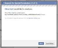


The don't Allow button is a fake trap, it's just go from 1 of 3 to 2 of 3 to 3 of 3 and back to 1 of 3 and the process goes over and over again in an infinite loop. I'm not sure if this's a bug, i hope it is. Because if it's not, i think it's rather irritiating. Not only irritating but you aren't really respecting user's privacy and decisions. Just because of this, I've not throwed a pillow and I don't think i'd be throwing one anytime soon. This loop is a rather serious problem and if it's a bug, i do hope it can be removed soon and i seek to make sure that such things won't happen to my app. It repulses users and can be a huge drawback from the game. My own seminar app proves it, I hate it, the pop up and spam invites, Cedric hates it, John Lew(his review on it) hates it too and I'm sure many others as well. Though certain pop ups are necessary, it have a huge potential at irritating people through it so i'd be caution at using it. One thing I don't mind about popups in farmville though i still don't really like it is that their pop up window are rather special, the first one anyway, before moving on to the default facebook ones. It can soften the edges a little and is definitely something that i can use in my app.
With all those said, i believe pillow fight do have a potential to do even better. Cleaning up with the advertisements, pop ups, add in a customisable feature, attack or defense bonuses e.t.c. are just ways to improve them. I guess, back to the foundamentals, it's there for entertainment, to let people have fun, involve friends and family, play with them and engage them through simple means that everyone have real life experience in, or at least know about it.
I've learnt a lot, not only from pillow fights but from the other applications presented in the seminar as well as other applications such as farmville (and here i thought someone would critique on it), farm wars, mafia wars and its variant. Truth to be told, a lotta features(those that we think make those app great) are picked from all over the place to complement our game. Look around, research (i mean comon, laurence played mafia war just for this app lol, LAURENCE PLAYED MAFIA WARS for a few days!!!) learn from them, adapt and innovate. We all start out as babies and i think what we do best is to learn from observing. I've learnt a lot from this and have thought of various stuff to make sure my app'll be better, have you?
Review
Pillow Fight - just when was the last time I actually have a pillow fight, perhaps when i was around 8 with my sister? I still hold those fold memories close and loved how we use to just whack each other with pillows and my favourite: bolster. The trill was there and it just feels nice to let go and literally whack! That was years ago, actually I can say decade ago. It really does bring back fond memories. Nowadays, as I observe that while I still find enjoyment and fun in other activities, I miss the child-like trill and fun in letting everything go and just do something silly just for the fun of it. It’s been a long time. That was what I thought of when I registered the words pillow fight. It was a representation of letting oneself go and have fun. It represents childhood and something, just pure of us.I believe that that's what the app's trying to achieve and bring across so that people can still put aside time for these small pleasures (though i do admit the clicking of the buttons can be a rather waste of time). I went to look at some of the post and it warms my heart to see stuff like this:

This pillow fight thing really does have its appeal. One of the points I still remember from the seminar more than 24 hours ago is that it is free, easy to use(even grandmas can use them) and though it's similar to super poke, it differs since it's competitive. I shan't go into those aspects as I'm sure you know those factors as it is. I guess the more important learning point in this is how does those features draws players in. As a matter of fact, pillow fight, first impression before this seminar was that it's similar to superpoke, just that the icon's a little different and it's competitive. when I come out of it, i still see roughly the same things but perhaps when i step one step back and review it again, i can perhaps, pick out why it succeeded.
It's free. I have nothing to say over this, it's in my impression that apps on fb are mostly free, even though super popular ones. Hence, I am still rather puzzled over the emphasis that it's free. On the flip side, this brings me to a point that i still strongly remember since it disturbs me a bit and when I went to the app it's so blatantly staring at my face. It's rather disturbing. Multiple rather inappropriate advertisement. Like that:

Im a 19 going to 20 lady and I'm highly disturbed by that. I believe the app is directly at all age groups, for friends and family, children, adults, grandmas.. To see similar contents with different pictures, no it's not even pictures, it's moving clips. it's rather disturbing i admit. It makes me wonder, are they that desperate for money to have those plastered all over the app? It just makes me wonder, are you doing the app for money or for the app, so that others can enjoy it. It's rather sad to see such a, how to call it, purely fun and innocent intention app to have these kinda advertisements all over. Though i do understand that it's nice to earn some money out of it, i personally do recommend to clean it up a little, at least put it at reasonable place, not in between your app and perhaps, spend a little more thought and time into selecting the appropriate types of advertisement. As the group mentioned, perhpas pillow advertisement may seem not as out of place and definitely decent.
Moving back to track, it's easy to use and also have the element of competitiveness in this as compared to superpoke, just like how it's counterpart in reality works. easy to use. really, if even grandmas can use them, i must say they're rather simple to use and that's the draw points. The learning curve is smooth, anyone can play, even your grandmothers. This pulls in the family factor and also the fact that adults can have virtual pillow fights though they may be a little on the old side to really play them. easy to use really do demolish the barrier of entry and attracts people into the game. A point i'd make sure to always keep in mind for our apps, to make it simple, easy to understand or like fameleauge, my seminar group's app, very elaborate and fanciful but it's sooooo complex after dunno how many days i still dun really quite comprehend how it works. If a group that's suppose to study it thinks like that, what about those players, i doubt they'd last 2 mins. One of the major drawpoints of pillow fight is its simplicity in concept and of course, you get to pillow fight with your friends and also your family - it's been a long time since i last whacked my sis with a pillow hmmm.... back to point.
competitiveness, which human doesn't have, though some a small degree but they still do have competitiveness. This creates a stickyness for the game and encourages players to come back. A rather smart move, esp if you're in a "serious" pillow fight and aboslutely won't want to lose. This works rather nicely. Though playing on the competitiveness part, the app can actually use some extra ideas that adds the fun elements. For example, certain features such as pillow enhancer can be added during the match using the credits or coins in this case to perhaps, shorten opponents' "reaction time" or lengthen yours. Not a complusory feature but do help enhance the game and make more interesting. Such brings me back to this observation, I don't really see much fundamental changes or enhancement for the app. Well, for my group, as im sure for others in 3216, the app's like our baby and we'll nurture it. We've spend a lot of effort, sleepless nights in the basement to bring our apps to life, for me, i'd always seek on ways to improve it. Improvement and enhancement, a VERY important element i believe in making an app not only successfull in the short term but also the long term is to literally keep it on its toes. Even Caleb's improving his farm wars~~
Talking about improvements, i see that pillow fights' updates mainly on the type of pillow you can throw. You've seen the pictures where there're like 50 odd page tabs of pillows, each only have 6 pillows. I think the really bad part of it is that some people'd get tired of looking through all the tabs, they stop at around 10 or so and worse thing of all, there's no indicator on which tab you are, good luck to those who forgot which ones they do click. While i think it's nice to have so many variety and introduce some level concepts where some pillow's still lock, a better presentation could have been imployed like, more specific tags, or perhaps a serach bar? Though i do believe that the picture quality of the pillow do have to improve and more though spent on this because some pillows are really just any random picture anyone can paste.

This one actually looks like those game models out there

and this is firstly, out of place due to the different template but oso it's rather obvious that's it's a pasted picture from somewhere else
While i like the concept and idea and considering that this app is successfull, i do believe that more effort can be spent on this app. Im not sure if you can really see it but through these small stuff like this and those spam advertisement that can be a little inapporpriate at times,makes one feel that this app is not really that much cared for,
Though talking about new pillows and stuff, i find this concept rather interesting and a little sad that pillow fight didn't really exploit it. the personalisation of pillows. Flipping through numerious pillows, i realise that a lot of those pillows are basically a background standard black pillow overlapped with a picture on top of that and viola, a new pillow~.This can prove to be a rather strong feature that pillow fight can exploit. I find this to be very true:

You can send a message without saying anything. In fact pillow fight do have these alr like seasons greetings, help raise awareness for certain issues like the given examples:


and oh woah, look at that, that's a rather long entry with my pictures alr so without further ado, i'd like to point out certain points that aren't exactly favourable in this application and while i learn from it, hopefully to not repeat those mistakes in my app. Pop ups.


The don't Allow button is a fake trap, it's just go from 1 of 3 to 2 of 3 to 3 of 3 and back to 1 of 3 and the process goes over and over again in an infinite loop. I'm not sure if this's a bug, i hope it is. Because if it's not, i think it's rather irritiating. Not only irritating but you aren't really respecting user's privacy and decisions. Just because of this, I've not throwed a pillow and I don't think i'd be throwing one anytime soon. This loop is a rather serious problem and if it's a bug, i do hope it can be removed soon and i seek to make sure that such things won't happen to my app. It repulses users and can be a huge drawback from the game. My own seminar app proves it, I hate it, the pop up and spam invites, Cedric hates it, John Lew(his review on it) hates it too and I'm sure many others as well. Though certain pop ups are necessary, it have a huge potential at irritating people through it so i'd be caution at using it. One thing I don't mind about popups in farmville though i still don't really like it is that their pop up window are rather special, the first one anyway, before moving on to the default facebook ones. It can soften the edges a little and is definitely something that i can use in my app.
With all those said, i believe pillow fight do have a potential to do even better. Cleaning up with the advertisements, pop ups, add in a customisable feature, attack or defense bonuses e.t.c. are just ways to improve them. I guess, back to the foundamentals, it's there for entertainment, to let people have fun, involve friends and family, play with them and engage them through simple means that everyone have real life experience in, or at least know about it.
I've learnt a lot, not only from pillow fights but from the other applications presented in the seminar as well as other applications such as farmville (and here i thought someone would critique on it), farm wars, mafia wars and its variant. Truth to be told, a lotta features(those that we think make those app great) are picked from all over the place to complement our game. Look around, research (i mean comon, laurence played mafia war just for this app lol, LAURENCE PLAYED MAFIA WARS for a few days!!!) learn from them, adapt and innovate. We all start out as babies and i think what we do best is to learn from observing. I've learnt a lot from this and have thought of various stuff to make sure my app'll be better, have you?
01 February 2010
Team needs coordination of ideas and communication
throughout the week where we're rentlessly rushing to get the assignment done, or at least the basic stuff up, i realise that communication is a very key issue and the crux of any group work. I know it is common sense but i learn that it is VERY important to have constant comminication, an update or what you and your group mates are doing, to always keep each other up to date. To always make sure that each of us have the same goals and how things should work is a very important point in group work. NEVER ASSUME. it's a fatal mistake to commit especially if you're doing a massive group work and the jobs are highly interdependent.
BASICS. it always boils down to this. basics. A very important step in all projects. foundations are to be layed and set upon before other fanciful stuff can be added to it. The same applies for any projects. the basics and the foundations of every project must be strong and able to support any future features(wishlist) you would like to add on to it. For my group, a major part of our foundation lies on our project plans and the underlying concepts. Our backend must be strong enough to support our front end and looking at our schema, i can honestly say i can't make out what the diagram's about, the lines are neat but are so closely knited it's hard to see without hovering your mouse over it and see it highlighted. All of those, while we hardly implement them are vital ascepts towards our project and forms a huge poportion of our project's foundation. Once our group's basics are up, it'd be much managable to implement it and extend it. It's this basic foundation that have us slaving nights and days without slp to get it out. I must admit, I'm at awe with the level of commitement my group's showing. Honestly, I'm impressed. though proff has a point, it's time to catch up on other modules, which for me is a lot >.< a great many thanks to my group mates for making it through though im sure life's still as busy, esp with the school work and hall commitements catching up with me and im sure many others (my ihg just start as well as my hall's internal projects though they're well on their way).
This brings me to the point of time management. People always complain that they do not have enough time but i believe we can always squeeze out more time. Definitely, it jsut needs discpline. Well, it's true that we can do a lot of things if we don't slp (my group have prove it time and again) i believe it is important to allocated time efficiently and diligently to different aspects of your life. Im not just talking about school, module stuff but also with your friends, family e.t.c. I keep feeling as if a whole semester have just passed and though it's only like, less than a week, i feel as if it's been decades i've not gone home. I missed my home. I went back on sat afternoon (slept it away) and came back on sunday to do seminar stuff and subsequently my hall internal project. Sometime it feels as if we're running a marathon (one that im glad to run) and i learn that it is VERY important to manage your time very properly or you'd miss a lot of stuff. Well I miss home so now that the fb assignment's done and the seminar will be done tomolo im going back home to spend the nigth with my family on tues. I miss the smell of my home (shrugs, im being sentimental but i really do miss the smell of my home and the blankets they're nice >.<) so im going back. oh well, free time now's dedicated towards catching up other modules and like prof said, we'd get a break starting from wed and I'm really gonna spend the time till cny to enjoy, rest and catch up with my studies.
Till then, i better catch up on my slp (never seem to get enough of it, it surprises me that this can make laurence, the one who never slpt past 10 and always wake at 6+ to overslp, it's jsut astonishing) and rush my tut tomolo, shrugs. I actually had a rather intersting conversation with my seminar teammates on a lotta things, like quirks and different events and what not, it's rather interesting >.< perhpas that can be my next blog~ till then, before my face crashes into my lappy~ good nightz~
Subscribe to:
Posts (Atom)